In the ever-evolving landscape of web design, responsive design has become a cornerstone of effective, user-friendly websites. With the rise of mobile devices and varied screen sizes, the need for websites that adapt seamlessly to different platforms is more important than ever. But what exactly is responsive design, and why should it be a priority for every website?
What is Responsive Design?
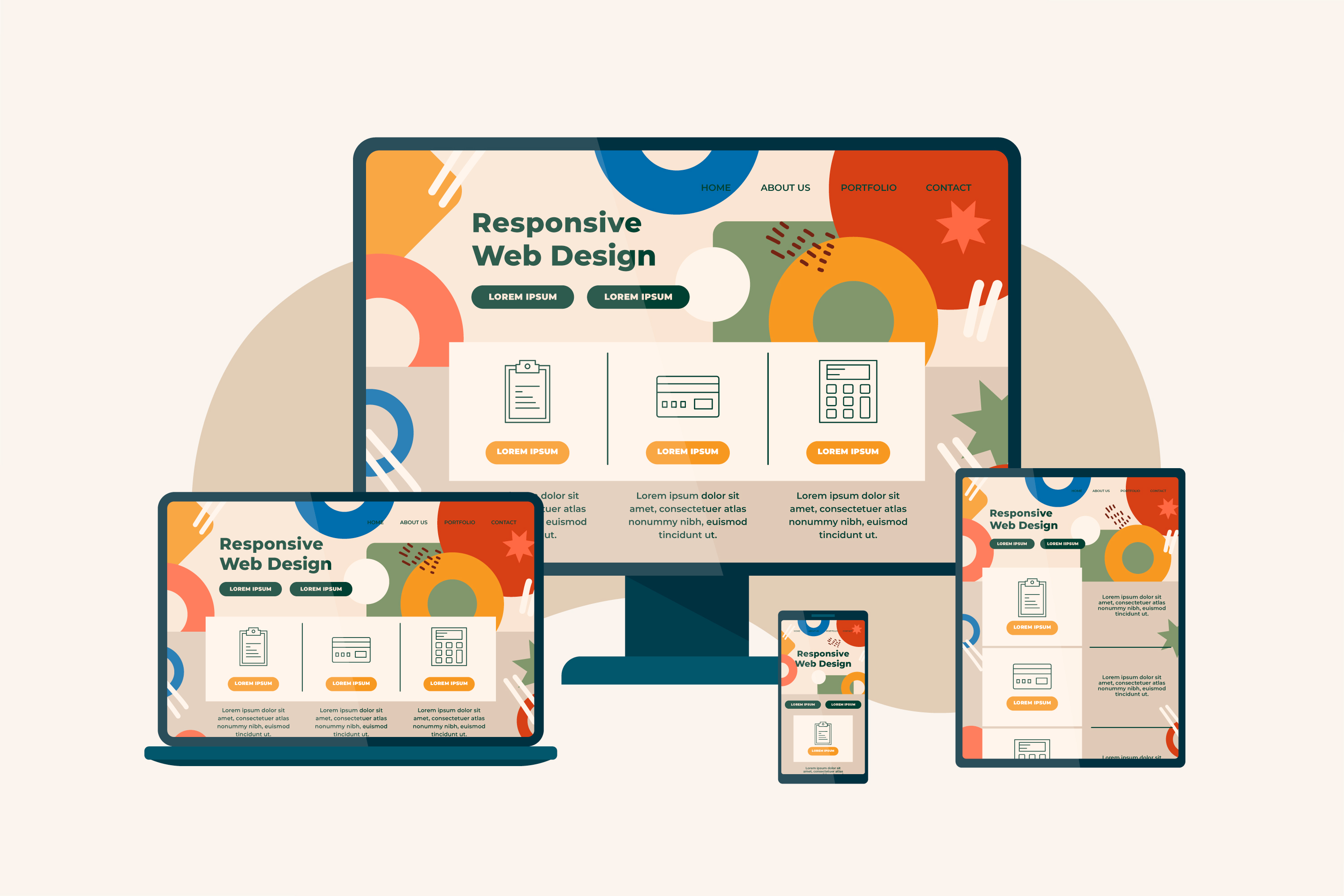
Responsive design refers to the practice of designing and developing websites in such a way that they provide an optimal viewing experience across a wide range of devices. Whether it's a smartphone, tablet, laptop, or desktop computer, responsive design ensures that your site looks and works well on all screen sizes. This is achieved through flexible grids, layouts, images, and CSS media queries that adjust the content according to the screen size, resolution, and orientation.
The Evolution of Web Design
In the early days of the web, websites were typically designed for desktop computers with standard screen sizes. As mobile devices like smartphones and tablets gained popularity, a new challenge emerged: how to create a web experience that works well on a variety of devices.
Initially, many webmasters opted for building separate websites or mobile versions of their sites, but this approach was often cumbersome and inefficient. Managing multiple websites required more resources and led to inconsistencies in user experience. Responsive design solved this problem by allowing websites to be built once and adapt to any screen size automatically.
Key Elements of Responsive Design
- Fluid Grids: In traditional web design, websites were often built using fixed-width layouts, which were problematic on devices with different screen sizes. Fluid grids use relative units (like percentages) instead of fixed units (like pixels), allowing elements on the page to resize proportionally.
- Flexible Images: Images that are fixed in size often don't scale well on smaller devices. With responsive design, images are sized relative to their container, ensuring that they resize dynamically without losing quality or stretching.
- Media Queries: Media queries are a powerful feature of CSS that allow the layout to change depending on the device’s screen size, resolution, or orientation. By specifying different styles for different conditions, designers can optimize the presentation for mobile, tablet, and desktop views.
- Mobile-First Design: Mobile-first design is a concept where designers start by creating a website optimized for smaller screens and then scale it up for larger screens. This approach acknowledges the prevalence of mobile devices and ensures that the core functionality and user experience are prioritized for mobile users.
Benefits of Responsive Design
- Improved User Experience: The main benefit of responsive design is that it creates a seamless experience across all devices. Whether users are browsing your site on a smartphone during their commute or on a desktop at work, they will encounter a layout that is easy to navigate and use.
- Increased Mobile Traffic: With mobile internet usage surpassing desktop usage in many regions, a mobile-friendly website is essential. Google even considers mobile-friendliness as a ranking factor in search results. A responsive design ensures that your site is not only optimized for mobile devices but also visible to users who access it through search engines.
- Cost-Effective: Rather than maintaining separate websites for different devices, responsive design allows you to maintain just one site. This reduces development and maintenance costs while also ensuring consistency across platforms.
- Faster Loading Times: Responsive design can lead to faster loading times, especially with techniques like image optimization. Since the same content is being served to users on all devices, there’s less risk of having excess or unnecessary files that can slow down the user experience.
- Better SEO Performance: Google recommends responsive design as the best approach for mobile optimization, and it can contribute to improved SEO. By having a single URL for all devices, search engines can better index your content and avoid potential penalties for duplicate content.
Common Mistakes to Avoid
While responsive design is essential, it’s important to approach it thoughtfully. Here are some common pitfalls to avoid:
- Overloading Pages with Media: A common mistake is loading large images or heavy files for all devices, which can slow down page load times. It’s important to optimize media files and use techniques like image compression to ensure fast performance.
- Neglecting Touchscreen Devices: Many responsive websites are designed with desktop and mobile in mind, but tablets and other touchscreen devices need special attention. Buttons should be large enough for easy tapping, and the site should be optimized for touch gestures.
- Ignoring Content Hierarchy: Responsive design isn’t just about resizing images; it’s also about how content is presented. Make sure your content is well-structured and that important elements are easily accessible, regardless of the device. Prioritize key content for smaller screens.
- Not Testing Across Devices: One of the most critical aspects of responsive design is testing. Make sure your website is tested across various devices and screen sizes to ensure that it’s truly responsive. Tools like Chrome’s Developer Tools and online testing platforms can help you simulate different devices during development.
The Future of Responsive Design
As new devices continue to emerge with unique screen sizes, responsive design will continue to evolve. Future advancements in CSS and HTML will likely provide even more flexibility in designing for an expanding range of devices. Additionally, innovations in AI and machine learning may lead to more personalized experiences, where websites automatically adjust not just to the device but to the user’s preferences.
Conclusion
Responsive design is no longer a trend, but a standard practice for building websites that cater to the needs of a diverse and mobile-first audience. It’s a holistic approach to web development that ensures your site is accessible, user-friendly, and optimized for all devices. As mobile usage continues to increase, adopting responsive design is the key to staying ahead of the competition and providing a seamless experience for your users, no matter how they access your site.